Honestly, $COLLECT is one of those charts that doesn’t look attractive at first glance… but when you actually sit with it for a bit, it starts telling a different story.
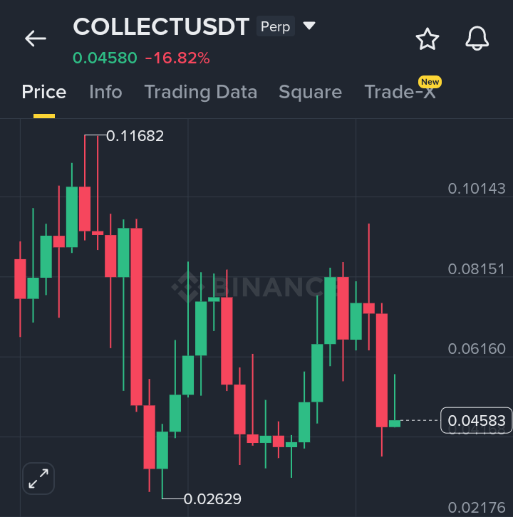
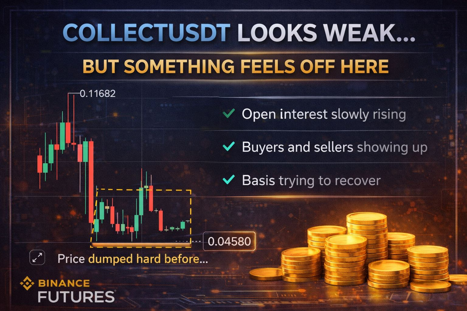
Yeah, price dropped hard from that 0.11 area. That move clearly flushed a lot of people out. Early buyers took profit, late buyers got stuck, and momentum just died. You can feel that shift in the chart, it’s not subtle.
But what caught my attention is what happened after the drop.
It didn’t completely collapse. Instead, it started slowing down, moving sideways, trying to hold a zone. That usually means sellers are losing strength. Not gone, but not dominating anymore either.
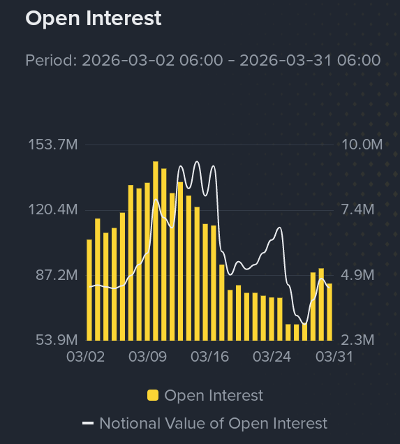
Then you look at open interest. It dropped a lot before, which makes sense, positions got wiped or closed. But now it’s slowly ticking back up. That’s important. It tells me new traders are stepping in again, not aggressively, but quietly.
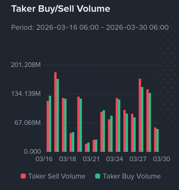
The volume also backs that up. There’s still activity. Buyers and sellers are both showing up, which means this isn’t a dead chart. It’s just… undecided.
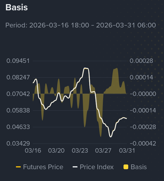
And the basis is interesting too. It was pretty weak overall, but now it’s trying to recover a bit. That kind of shift usually happens when sentiment starts changing slowly, not all at once.
If I’m being real, this doesn’t feel like a strong bullish setup yet. I wouldn’t jump in blindly.
But it does feel like the kind of place where something could start building.
Like… this is the phase where most people ignore it because it looks boring or messy. But sometimes, this is exactly where early positioning happens before a cleaner move shows up.
If I were watching this, I’d just wait. See if price can hold this range, see if buyers slowly gain control.
Because if that happens, this could turn into a nice early entry before everyone else notices.
Right now it’s not exciting…
but it’s definitely not dead either.
