The claim updates cleanly on Sign.
The dashboard doesn’t forget as cleanly.
That gap looks administrative.
It isn’t.
I keep circling back to this because status updates feel like closure. Something changed. The record reflects it. The system did its job. On Sign, that part is almost too easy. A claim shifts state. Revoked, adjusted, narrowed. The truth moves forward without friction. Everything about the source layer says “this is current now.”
But the dashboard was built earlier.
And it still thinks earlier matters more.
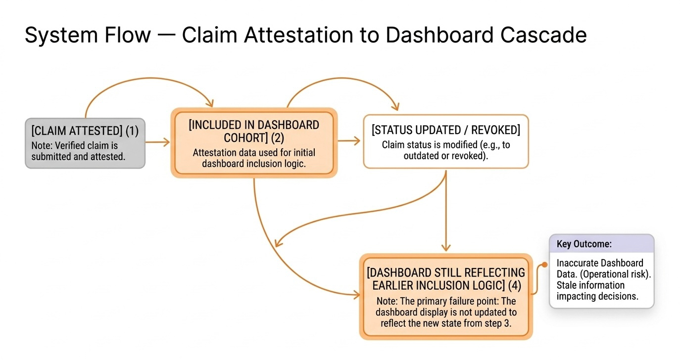
A claim gets attested once. Clean. Approved. Included. That moment doesn’t just live in the record. It gets captured. Pulled into a cohort. Slotted into a segment. Counted in a way that starts shaping how the system is viewed. From that point on, the first version of the claim stops being just a state. It becomes a reference point.
And dashboards don’t let go of reference points easily.
That’s where it starts drifting.
Not incorrect data.
Not broken updates.
Something quieter.
The claim changes.
The interpretation doesn’t.
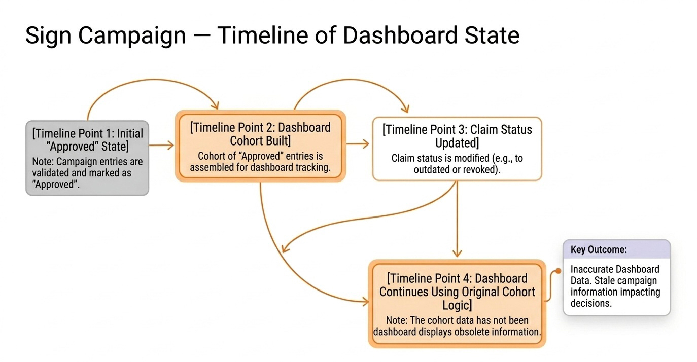
A system builds a clean population early. Approved wallets. Eligible users. Verified accounts. Whatever label made sense at the time. That grouping becomes useful fast. Teams rely on it. Reports depend on it. Weekly reviews start from it. It becomes the shape of the program’s “health.”
Then the claim changes later.
Maybe it gets revoked. Maybe conditions tighten. Maybe the approval no longer holds the same weight. The source reflects that shift instantly. But the dashboard isn’t built to question its own structure every time the source moves. It updates rows. It rarely rebuilds meaning.
So the earlier inclusion survives.
Not loudly.
Just persistently.
The claim is no longer clean in the present sense. But the dashboard already learned to treat it as part of the clean population. And unless someone explicitly removes it, that earlier classification keeps echoing forward.
That’s the part that feels off.
Because nothing is technically wrong.
The record is accurate.
The update is real.
The dashboard is consistent.
And yet the picture is misleading.
The system shows current state.
The dashboard shows inherited confidence.
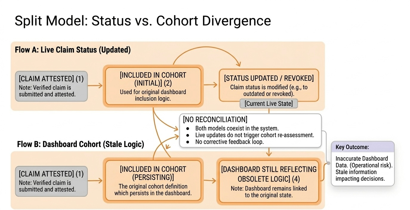
This is where Sign becomes sharper, not safer. The clarity of the claim makes it easy to use. Easy to group. Easy to count. That’s the strength. But it also means the first clean state gets operationalized quickly. And once it does, it hardens into reporting logic.
The dashboard doesn’t just reflect the claim.
It remembers the moment the claim looked best.
And it keeps building from there.
So when the claim changes, the system adapts.
The dashboard hesitates.
Not because it can’t update.
Because it wasn’t designed to question what it already included.
That’s a different problem.
Teams start explaining it away. The report is slightly delayed. The cohort updates overnight. The numbers are “mostly current.” All technically reasonable. None of them address the real issue — that the grouping itself was built around a version of the claim that no longer defines reality.
And that grouping still drives decisions.
A revoked claim stops being valid in the system.
It doesn’t immediately stop being useful in the dashboard.
That’s the leak.
One record doesn’t matter much.
But systems don’t break on one.
They drift on accumulation.
A few outdated claims stay inside a clean segment. Then more. Then entire slices of the dashboard start carrying a version of reality that already moved on. The chart still looks stable. The population still looks strong. The narrative still holds.
Because the dashboard learned from the first answer.
And nobody forced it to relearn.
That’s the uncomfortable part.
The source evolves faster than the interpretation.
And interpretation is what people actually act on.
So reviews start from the dashboard.
Not the claim.
Decisions follow the same path.
The system says one thing.
The summary says another.
Both defensible.
Together misleading.
Sign keeps the claim accurate.
Exactly as it should.
But once that claim gets pulled into a reporting shape, it inherits a second life. One where earlier states linger longer than they should. One where inclusion matters more than revision. One where the first “yes” keeps echoing even after it’s been taken back.
And unless someone rebuilds that layer deliberately, the dashboard keeps telling a story the system has already corrected.
Clean update.
Sticky interpretation.
Same data.
Different reality.
And the longer that gap sits, the harder it becomes to notice that the confidence in the chart is coming from a version of the claim that no longer exists.