Introduction to Candlestick Charts
Candlestick charts are one of the most essential tools in technical analysis, widely used in financial markets such as cryptocurrencies, stocks, and forex. Originating in Japan centuries ago, this charting method provides a visual representation of price movement within a specific time frame. Each “candle” reflects four key data points: open, high, low, and close. Unlike simple line charts, candlestick charts reveal market psychology, allowing traders to interpret the battle between buyers and sellers.
🕯️ Structure of a Candlestick
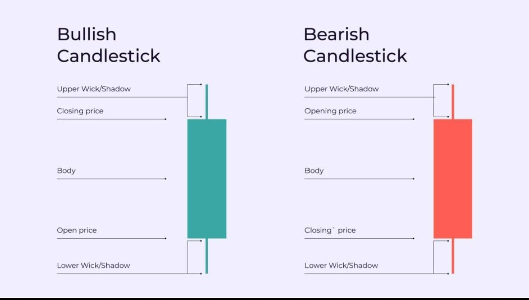
A single candlestick consists of a body and wicks (also called shadows). The body represents the difference between the opening and closing prices, while the wicks show the highest and lowest prices during the period. A green (or white) candle indicates that the closing price is higher than the opening price, signaling bullish momentum. Conversely, a red (or black) candle indicates bearish momentum, where the closing price is lower than the opening price. The length of the body and wicks provides insight into market strength and volatility.
🔎 Understanding Market Psychology
Candlestick charts are powerful because they reflect trader behavior. For example, a long bullish candle suggests strong buying pressure, indicating that buyers dominated the session. On the other hand, a long upper wick shows that buyers pushed the price higher, but sellers stepped in and forced the price back down. This often signals potential resistance or a reversal point. Similarly, a long lower wick indicates rejection of lower prices, which can be interpreted as a support signal.
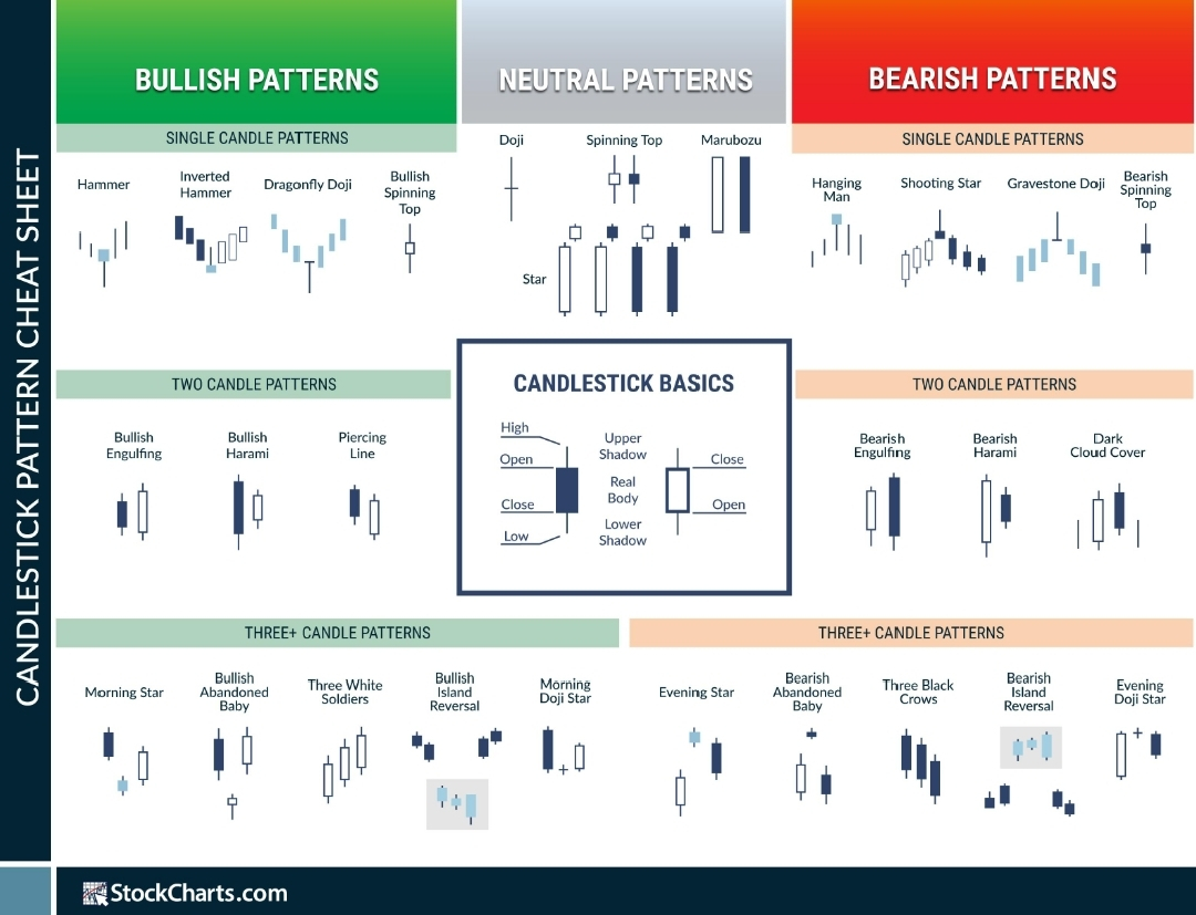
📊 Key Candlestick Patterns
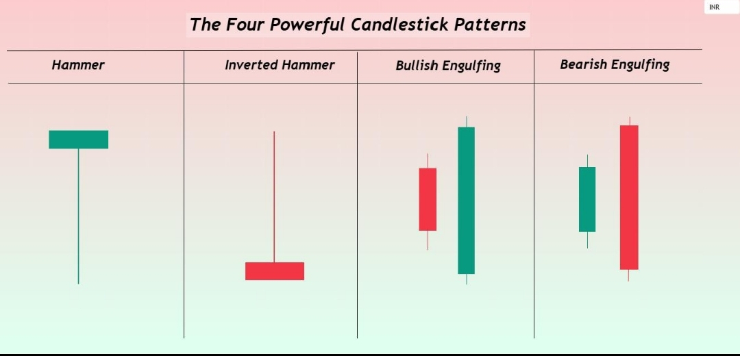
Several candlestick patterns help traders predict future price movements. The Doji pattern, where the opening and closing prices are nearly equal, indicates indecision in the market. The Hammer pattern, characterized by a small body and long lower wick, often signals a bullish reversal after a downtrend. The Engulfing Pattern occurs when a larger candle completely engulfs the previous one, indicating a strong shift in momentum. A bullish engulfing pattern suggests a potential upward move, while a bearish engulfing pattern indicates a possible downward trend.
📌 Support and Resistance with Candles
Candlestick charts are most effective when combined with support and resistance levels. Support is a price level where buying pressure is strong enough to prevent further decline, while resistance is where selling pressure stops upward movement. Candles often form specific patterns near these levels, such as rejection wicks or consolidation zones, providing high-probability trading signals. For instance, repeated long lower wicks near support suggest that buyers are defending that level.
📈 Trend Identification
Traders use candlestick charts to identify trends. An uptrend is characterized by higher highs and higher lows, often accompanied by consecutive bullish candles. A downtrend shows lower highs and lower lows, with frequent bearish candles. Sideways markets, also known as consolidation phases, show mixed candle patterns with no clear direction. Recognizing the trend is crucial because it helps traders align their strategies with the overall market direction.
⚠️ Limitations and Risk Management
While candlestick charts are powerful, they are not foolproof. False signals can occur, especially in highly volatile markets like cryptocurrencies. Therefore, traders should always use additional indicators such as volume, moving averages, and RSI to confirm signals. Risk management is equally important; setting stop-loss levels and managing position size can prevent significant losses.#BitcoinPrices #sign